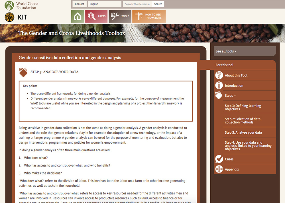
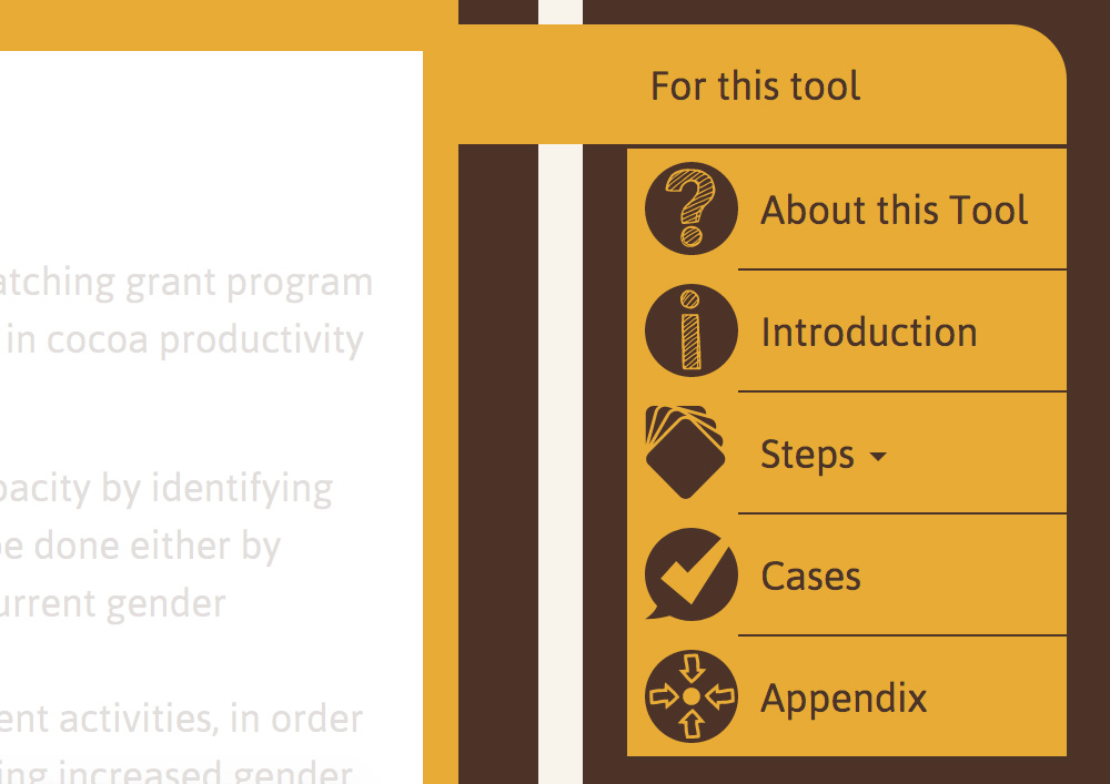
The challenge with this website was in clearly structuring a large amount of information. The most important part of the website is the toolbox with currently 6 tools. I chose to work with colors and icons to increase visual recognition, so that the user always knows where he left off (“Oh yes, I just finished the blue tool”). Each main part of the menu has its own color and each tool has its own color. These colors have been carefully chosen to match WCF’s visual identity and are also different enough to maintain the distinction between the different tools.